Saturday, December 29, 2012

Some ipad apps tried and tested


Over the winter break I took home an iPad from school to fish around for some potential uses in the art room.  The last time I did this was a  year ago and I had NO idea what I was doing or how to even use an iPad.  This time around after taking 2 courses I'm much more adept at navigating the dizzying maze of apps available and after researching the web for the most highly rated art education apps and talking to a few fellow teachers, I  compiled a list of about 35 apps some good some not so good.  I specifically looked for things that were education based and not really simple game or drawing programs.  The way I figure it, if it's a pastel, paint, crayon/marker or watercolor 'drawing' app it's not the most useful considering the kids have the real thing at their disposal!

I made the chart like this: Anything in red I didn't care for.  Anything in green I liked and would consider using in the art room. Anything in black I have not tried yet because there wasn't a free download available.
The genre category has the genre that the app was listed under from the app store (education, utilities, reference, etc) and after that I wrote the category I would consider it for use in my art room (art reference, E elements and principles, sculpture etc.)  I plan on purchasing a few and trying them out so when I do I'll post my reviews of the as yet untested apps I listed.


Thursday, December 27, 2012

Aztec Suns 5th Grade


As part of our Aztec unit, my fifth graders followed up their Aztec warrior illustrations with foil embossed Aztec suns.  To begin this project I showed students a condensed and age-appropriate version of the many myths of the Aztec sun gods.  We then viewed and discussed some features, specifications and features of the Aztec calendar stone.  I posted a few images of illustrated calender stones on my Smart board and students began sketching.
 I had the students use circle templates in either large, medium, or small and then had them use basic shapes as a way to design a face.  After finishing their sketch the students used a wooden stylus to press their image onto silver foil.  When they finished embossing their sun, they embellished it with colored Sharpie's.  Lastly, students used Aztec design reference sheets to get ideas to decorate a scratch art border. The lesson was a big hit. My fifth graders loved creating their suns and they got a LOT of compliments on all their hard work!


 Just a few quick tips for working with embossing foil:
-Use magazines to place under the foil when embossing.  It acts as a sort of cushion and helps to make pressing the lines into the foil a bit easier.
-If students are tracing a design from paper onto the foil, have them use masking tape to secure the drawing in place.  Do not tape the foil to the magazine, you want students to be able to flip the foil over as they go so they can check their progress. Also, if the masking tape covers their design they can still emboss right over it.
-Give students a heads-up that embossing foil is NOT the same as tin foil but is heavier and that the edges can be sharp and cause 'paper' cuts.
-Every once in a while replace the styluses, they can get dull as they get used repeatedly.


Tuesday, December 25, 2012

Merry Christmas


Wishing everyone a happy and healthy Christmas!

Sunday, December 23, 2012

O'Keeffe-Where Does Your Ladder Go? 4th grade


Ladder to the Moon (1958)  by Georgia O'Keeffe

I first saw this painting at the Whitney Museum of American Art.  The museum has collected this piece as part of its permanent collection.  I have yet to meet a person who doesn't like the artwork of Georgia O'Keeffe but most enthusiasts don't realize her repertoire includes all sorts of landscapes, cityscapes, minimalist abstracted bone paintings, and even these sort of surreal or ethereal paintings. In my opinion some of the work she created towards the end of her life is the best. 

When I first saw this picture, the description on that placard that accompanied it mentioned that this may have been the artists depiction of spirituality.  It said something like this:  In the painting the desert is dwarfed to a silhouetted landscape and the moon, is reduced to a sliver of silver light barely visible among the strong turquoise blue of the sky.  The central ladder is the largest, most prominent feature in the work and acts as a bridge between the metaphorical 'life' of the desert and 'afterlife' of the moon.  The ladder is the symbolic journey between the two.

Apparently O'Keeffe was inspired to create this painting after spending many nights on the roof of her Ghost Ranch. (Check out Architectural Digest's photo slideshow of Ghost Ranch HeRe)


 No one knows exactly why artists create the images they do but the first thing I thought after reading the placard and seeing this beautiful work was "where would my  ladder go if I had a ladder to that could take me anywhere?" My second thought was "wow, that would be a really great art lesson!"  And so...I had my students create an artwork that answered the question "where does your ladder go?"

To begin the project I had students create a hilly Elmer's glue-landscape about half way up the page.
 Then, when dry, I had the students color in the hills using warm colored chalk pastels. Most students loved the bright and messy experience of using the chalks.

 Once finished with the chalks, students sketch out an idea for a scene.  The scene could have been fictional or realistic, It could have been somewhere they had been or somewhere they dreamed of going.  It could have been someplace as simple as their bedroom or as far away as space.  My only caveat was that they had to put enough details in their scene to make sure the viewer could tell where it was and what some of its features were.
 Some children chose to depict a fun candy-land or favorite scene from a movie or book they love.  Some chose realistic places like the grand canyon, London, or vacation spot like the Caribbean. 
 What was great about this lesson was the originality and personality each piece contained. 


Saturday, December 22, 2012

Clay Slab Leaf Bowls with Crystal Magic Glaze

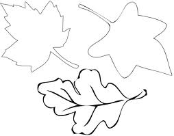
 This project took a total of 3 40 minute sessions.  To start the lesson I had students come in and choose a paper leaf template they liked to cut out.  The leaf templates fit onto a 8 1/2 x 11" piece of printer paper.


After cutting out their leaf I demonstrated how to roll out a 1/4" thick slab of clay using a rolling pin.  I didn't have students use sticks as a track so I really tried to emphasize that they roll as evenly as possible without having the clay be overly thick or thin in any area.  Students used their template as a guide for how large the slab should be.  Once everyone had a slab rolled I went over the directions for writing their initials in the clay with a wooden stylus and for how to wrap their clay in damp paper towel and seal in a plastic bag.  Just a helpful tip, for certain clay projects I put the whole classes work on plastic cafeteria trays and wrap it myself, but for other projects I'll have the students use ziploc freezer 'slider' bags.  I prefer the slider style because it ensures that the bag will be sealed, the regular 'press' ones (where the yellow and blue become green when you press it) can believe it or not be troublesome for certain students.

 On day two I handed out the slabs and then demonstrated how to 'cut' out the leaf shape by tracing the template with a stylus.  It's important when creating a slab anything in clay to cut a clean edge otherwise after the clay is bisque-fired the edges may come out sharp or jagged.  After the students cut out the shape of their leaf and smoothed the perimeter I had them gently press it into a bowl.  The clay doesn't have to be pressed all the way to the bottom of the plastic bowl it just has to be centered and pressed in slightly for the bowl shape to be created.  Some of my students wanted to press so hard that the clay began to crack or tear.  An option you also have is to drape the leaf over an upside down bowl, but since the bottoms of my plastic bowls were flat I was worried the leaf wouldn't produce as rounded a shape as if they were sunk into the bowl. Students had the option of adding veins to their leaf or leaving it blank.


 On the final day of the project, after the leaves thoroughly dried out and were bisque-fired, the students glazed them. I tried Sax True Flow Crystal Magic glazes.  They have these tiny chunks of different colors in them so when fired, are supposed to create a tie-dyed effect.  My personal opinion was that the glazes were O.K. and not great.  I love the idea of getting a speckled effect but here were a few problems I had with them:


1.  Most of the 'speckles' settle to the bottom of the glaze bottle so no matter how much you SHAKE or STIR the bottle by the time you finish it there was always A LOT of the particles leftover. 
2. Each color only contained 1 alternate color speckle inside it.  So for instance, the yellow which was called 'buttercup blue' had only blue speckles.  So in order to achieve a variety of different color blends you really had to overlap many different colors of glaze. 
3.I ordered the 12-color set so I received all of the colors seen above, but  they are not as nice as they appear...The original glaze colors (not the speckles) are quite a muted assortment of off-white, white, grey, soft blue, soft pink, soft purple.etc.  I would have liked these colors to pack more punch, I think the glazes would have been even nicer if they came in brights like orange, green, pink etc. 
4. When fired, you have to be very careful because  in order to really see the speckles you have to apply AT LEAST 3 coats of glaze and then when you glaze fire, even with the clay prongs under the slabs,  the little speckles tend to melt and drip onto the kiln shelf.  I didn't have any projects fuse to the shelf, but I had a few prongs I had to break and quite a few really jagged and sharp chips I had to file before I handed these back to the kids. At one point I had 3 band aids on my fingers from clay 'paper' cuts from some of those jagged edges.
5. Because of the thickness of the glaze application you may loose the carved initials on the back of the projects so I had to make sure that the students carved them on the back really large and really clearly.

The pro's of the glaze is that it does come out very shiny when fired, it is a low fire glaze so you can fire it at cone 06 on a fast fire and that even though the effects weren't necessarily what I was hoping for, the kids thought it was the coolest stuff ever :)


 * Some of the colors seen above are 'Buttercup Blue', Oriental Carmel', 'Tahiti Grape',  and 'Herb Garden.'

Saturday, December 15, 2012

My thoughts and prayers to all those who are suffering as a result of Friday's tragic events.

Friday, December 14, 2012

2nd Grade Surreal Trees


This project took 4 days. For the first period of the lesson I used 12 x 18" watercolor paper and liquid watercolors.

 Students chose 3 colors and created a wash any which way they wanted on their paper.  On the second day I watered down black tempera with water (1:1 ratio) and after dripping the watery paint on the paper, the kids blew it around with a straw.  The result were wiry. weird, and wacky tree branches. One side note, I also tried to use black liquid watercolors with a tiny bit of water and they spread nicely when blown, but came out a much lighter black.  The tempera with the water came out much more vivid. On the third day students drew hills in the background using crayons.  The last day of the lesson students collaged images (no bigger than the palm of their hand) onto their artwork to help make the work even more surreal. . 

Students viewed a different Dali artwork each period of the lesson and learned the idea that surrealism is all about transforming the ordinary into the extraordinary.


Thursday, December 13, 2012

Cupcake Triptych...in the style of (4th grade)


This is one of my favorite lessons. There is just something about the sweet subject of cupcakes that gets every student excited.  My impetus for creating this lesson was to loosen up my approach to teaching and frame the project with a problem and then give the students multiple options in order to answer it.  For this lesson, the subject was cupcakes and the challenge was to create a triptych using in 3 different media and portraying 3 different artistic styles. 
The media options included colored pencil, crayon, marker, oil pastel, and paint. The different artistic styles included cubism, fauvism, surrealism, and realism.  
When introducing the project I gave each table a packet with pictures explaining each style and the project criteria. I gave them a few minutes to examine the packet as a table group, discuss the information, and think of any questions they had regarding it.  As a whole class I addressed the questions and the students then got started. They used reference pictures to sketch a cupcake and when they created a drawing they liked, they used carbon paper to replicate the sketch 3 times so that the original cupcake began exactly the same on each square.  
I love this lesson because of the originality and sense of accomplishment it gave each student.  Each piece is unique to it's creator and because they had to use the information given to create a work of art, the characteristics of each style really stuck with them.  
The only caveat that I'd like to add to this lesson is that this class happened to be an extremely well-behaved and focused group so it was easy for me to give them the kind of freedom and access to so many materials that this project required.  They really needed little to no reminders of where things go to cleanup, how to handle materials respectfully, to stay focused or on task, or motivation to learn the information. I believe the lesson was a great idea but the ease of management really helped too!