Sunday, January 30, 2011

Milton Avery at the Nassau County Museum of Art


Milton Avery was a painter who created work from the 1920's until the early 1960's. His work is not entirely considered mondernist in style but acts as a sort of intermediary between modernsim and abstract expressionism. Avery's aim to reduce the picture plane to solid forms of color while still retaining the represented objects volume and perspective influenced future artists Mark Rothko and Adolph Gottlieb and colorfeild painting.

The museum had a pretty nice selection of Avery's work, with paintings and sketches taking up 4 rooms in the museum. Here's a few pictures I snapped of works that I particularly liked:


Friday, January 28, 2011

Square 1


*Credits to Deep Space Sparkle for the Sailboat Sunset Collage Lesson
'Easy Sailboat Project for First Grade'

Square 1 Art

I'm currently working with the PTA do do our schools annual 'Square 1' Fund raising Project. It's a school-wide project where each student completes a work of art on an 8 1/2 x 8 1/2 inch piece of paper that then gets sent to this company and turned into whatever products the parents order. It's very similar to the offer artsonia gives for parents for their child's work.

I'm very excited to be participating in this, however, the previous art teacher at the school allowed the students to do entirely their own work based on a 'theme so for example, the previous years work was animals, and so many of the students were complaining about the projects that I had assigned each grade. I was worried that if I let the students do whatever they wanted that the parents would be upset that the artwork didn't look 'finished' enough or that the students work wouldn't fill up the page or translate well into the finished products, especially kindergarten and first grade. So, instead of letting them have free reign I structured a quick 2 day lesson for each grade, and I do always encourage them to incorporate and use their own ideas into the work, but I always worry. Sometimes I wonder if I structure the lessons too much, I don't want the children to think I'm some kind of art control freak and have them get discouraged or frustrated thinking that I'm making them do things they don't want to. I understand that art, especially elementary art should have an element of spontaneity and give the students as many creative options as possible, but where do options start and structure begin?

Maybe the next time I do Square 1 I'll keep the outcomes and topics looser and see what happens, also, the next time I have to do this will be my 3rd year at the school and I'll undoubtedly be more settled in than I am now having only been here for 5 months. O.k. enough yammering on. LOl!

Thursday, January 27, 2011

Snow Days and Bulletin Boards


* The lessons on the bulletin boards were adapted from
Guitars: Phyl at There's a Dragon in My Artroom Blog
Rainforests: Mr. E. at Art with Mr. E.
Hands: source unkonwn (if you posted this lesson let me know and I'll give you credit for it)

Today is a snow day, school is canceled and I'm stuck in! So, I thought I'd write a post. I have a few pictures of bulletin boards I've recently done and thought I'd post them, but now that I'm thinking about it, I'm going to write a bit as well...

I always thought it would be a great idea to make a book about bulletin boards. The books I've seen out there are generic, at best and mostly deal with general education classroom topics. Don't get me wrong, I don't mind the cute catch phrases that most of these books highlight, but nothing beats a good creative bulletin board.

In my opinion, art teacher always come up with some of the best bulletin boards in their school. We spend countless hours, cutting, mounting, stapling, labeling, laminating, trimming, painting, sign making, description making, poster-making, eek, and more, on our bulletin boards and I think our efforts should be documented (and shared). I remember back on how overwhelming bulletin boards would be to me when I student taught, I used to get 'blank canvas' syndrome thinking of just how I would not just hang the students work, but really try and make the board interactive, a sort-of visual experience for the viewers. At this point I've by no means mastered the art of the bulletin board, but I"m slightly more comfortable with filling the spaces. Although I still can't stand changing the background paper! Had I had a bulletin board book to help me generate some ideas when I was learning how to teach it would have been a big help. Plus, it would have given me a bunch of ideas for lessons! Hmm, maybe one day when I have time I'll sign up to teach an 'how to create a teaching bulletin board' class at a conference or something. I think it makes for an interesting topic don't you?

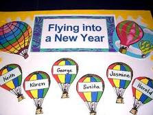
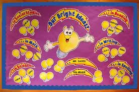
Here are two of those 'catch-phrase' bulletin boards I mentioned above:


Monday, January 24, 2011

Kindergarten Mouse Paint


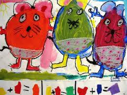
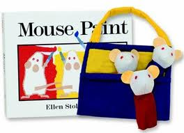
Following a lesson on Piet Mondrian and primary colors, I introduced my kindergartners to the book 'Mouse Paint by Ellen Stoll Walsh. This is a really well known book for young children, it could easily be used for a pre-k lesson as well. I've also seen this lesson done a couple of different ways, all with successful result. The way I did it, the lesson took about 5 sessions. Admittedly, I made the lesson slightly harder than it had to be, having the students draw all their mice first, but I think it was a good learning experience for them and the finished mice really show their personalities. Here's how I did the lesson;
Day 1: I used guided drawing to show the students how to make mice in 3 different poses using tear-drop shapes. At first they practiced on white boards, and then when I saw they all felt comfortable, I had them begin drawing their mice on white paper.
Day 2: The students finished drawing their mice and then traced them in sharpie, erasing all the pencil lines underneath.
Day 3: We reviewed the primary and secondary colors, after reading the book and then I put a pdf image i made showing the color formulas on my visualizer. The students had to begin by painting the 3 primary colors first in watercolor paint.
Day 4: They mixed the secondary colors and painted them. They cut out all their mice and began creating 3 primary or secondary colored 'jars' out of construction paper, to have as a background for their mice. Just like in the story.
DAy 5-6: The students finished their backgrounds and then I stapled a colored paper border around their work which they began decorating. I emphasized the creation of a pattern for their border design, but did not require them to adhere to one.
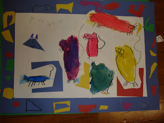
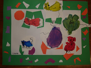

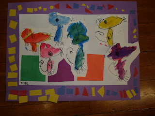
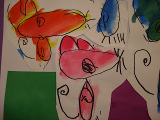


All in all they did a great job, but the lesson was a bit tedious, I've seen and read about it being done different ways. For instance, there is a fellow blogger who did a Mouse Paint lesson and had the students paint the circle first and then had them draw the mice around the circles, which is really much more practical and equally (if not more) effective than what I did. Here are a few other images I found when I was 'googling' ideas for how to use the book! If you have done a lesson on Mouse Paint leave me a comment and I'll edit in a link to your page, especially if one of the images I've put up here or mentioned is yours I'd like to include your name in the post.


Hampstead Academy Artsonia Page
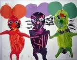


Libraryarts.com
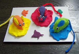


Person/teacher/site unknown
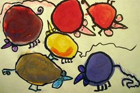


Person/teacher/site unknown


art-paper-scissors.blogspot.com


'One Crayola Short'